
What Is a Gantt Chart? A Plain-English Guide
A Gantt chart shows tasks as bars on a timeline, so you can see what's happening when, and what depends on what.
The short version
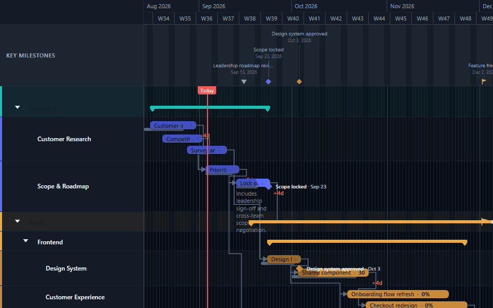
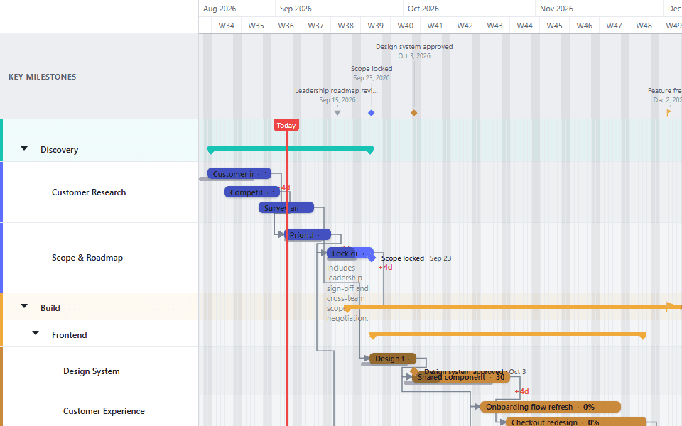
A Gantt chart is a bar chart that shows tasks laid out against a calendar. Each task gets a horizontal bar: where the bar starts and ends shows when the task happens, and its length shows how long it takes. Stack every task in a project this way, one row per task, and you get a single picture of the whole schedule.
That's the entire concept. Everything else (dependencies, milestones, progress, baselines) is detail added on top of that basic bar-on-a-timeline idea to answer more specific questions.
Read the lanes and bars
Each row, or lane, holds one task or a group of related tasks. The bar's left edge is the start date, the right edge is the end date, and the space between them on the timeline running across the top is the duration.
Read the connections between bars
An arrow drawn from one bar to another shows a dependency: the second task depends on the first in some way, most often that it can't start until the first one finishes.
Read the extra markers
A diamond or flag icon on the timeline, rather than a bar, marks a milestone: a fixed point in time with no duration of its own, like a launch date or an approval. A partially filled bar shows how much of that task's work is reported as done.
Why a bar chart, specifically
A list of tasks with start and end dates already contains all the same information a Gantt chart shows. The reason the bar format won out for scheduling is that it makes two things visible at a glance that a list buries: overlap and sequence.
Overlap is visible immediately. Two bars sitting side by side at the same point on the timeline are running in parallel. A list of rows with dates requires the reader to mentally cross-reference every pair of tasks to notice the same thing.
Sequence is visible through position, not just through reading. A task's bar sitting further right than another's shows it happens later, without requiring the reader to compare two date columns. Add dependency arrows and the sequence becomes explicit rather than merely implied by position.
Neither of these is impossible to get from a spreadsheet. They're just slower to get, and slower to communicate to someone else looking at the same data for the first time.
The parts of a Gantt chart, one at a time
Tasks and bars. The core unit. Every unit of work that has a start date and an end date becomes a bar. A task with no fixed duration, only a point in time, is better represented as a milestone instead; see below.
Lanes. Tasks are organized into lanes, which group related work by phase, by team, or by workstream, depending on how the chart's author chose to structure it. A lane with no tasks of its own but several lanes nested inside it functions as a phase header, rolling its children up under one label.
Dependencies. The lines connecting bars, showing that one task's timing depends on another's. The most common type, by far, is Finish-to-Start: the second task can't begin until the first one ends. Three other types exist for less common relationships; see dependencies explained for the full set.
Milestones. A diamond, flag, or similar marker for a fixed date with no duration: a go-live, a signed contract, a regulatory deadline, a steering committee decision. Milestones are often linked into the dependency chain so they visibly move if the work producing them slips; see rescheduling without breaking dependencies.
Progress. A partial fill inside a bar showing how much of that task's work is reported complete, usually entered by hand rather than calculated automatically. See showing percent complete for how that reporting actually works.
Baselines. A saved snapshot of a task's original planned dates, shown alongside its current dates so the reader can see how far the schedule has drifted. This is a comparison tool, not a default part of every chart. See tracking schedule slip with a baseline.
What a Gantt chart is not built to do
It is not a critical-path calculator. Drawing dependencies shows which tasks are connected. It doesn't automatically compute which chain of tasks controls the project's overall finish date, or how much slack exists elsewhere. That analysis is a judgment the chart's author still has to make.
It is not a resource allocation tool by default. A Gantt chart shows when tasks happen, not automatically whether the same person or team is double-booked across two overlapping bars. Some tools layer resource views on top; the base chart format doesn't do this on its own.
It is not a substitute for a written explanation of what changed and why. A chart shows the schedule at a point in time. It doesn't carry the reasoning behind a change, which is why a chart shared as a status update usually needs a short accompanying note, not just the image.
Where the format works best
A Gantt chart earns its keep on work with real dependencies and a meaningful timeline: a product launch, a construction project, an implementation with sequenced phases, a marketing campaign building toward a fixed date. The format's whole value is showing sequence and overlap, so work that's genuinely unsequenced (a flat backlog with no task depending on another) gets less out of it than a kanban board or a simple list would provide.
If you're deciding between a Gantt chart and a simpler timeline format for your specific case, see project timeline vs. Gantt chart for the practical difference.
A short history worth knowing
The format predates modern software by roughly a century. Henry Gantt developed his version in the 1910s for tracking industrial production, building on earlier bar-based scheduling work, including Karol Adamiecki's harmonogram from the 1890s. What made Gantt's version stick wasn't a fundamentally different idea; it was clarity and timing: a simple, readable format that arrived just as large-scale industrial and military projects, including World War I production scheduling, needed exactly this kind of visual coordination tool.
The format has barely changed at its core since. What changed is everything around it: from hand-drawn paper charts, to dedicated desktop project-management software in the 1980s and 90s, to today's browser-based tools that update in real time and export directly to a shareable file. The bars-on-a-timeline idea has outlasted every generation of tooling built around it, which is a reasonable signal that the core concept is solving a genuinely durable problem rather than a fashion in project management.
Reading a chart you didn't build
Reading someone else's chart cold is a different skill from building one. It's worth a note here since it's often the more common situation: a client sends over a project plan, or a new team member inherits an in-flight schedule.
Start with the milestones. They tell you the fixed commitments before you try to parse every task bar. Then look for the longest bars and the ones with the most dependency arrows attached; these are usually the tasks that matter most to the overall timeline, even if they aren't labeled as such. Finally, check whether progress or baseline information is present; if it is, that tells you not just what's planned but how the plan is actually tracking, which is often the more urgent question when you're seeing a chart for the first time.
Building your first one
The fastest starting point is a ready-made template close to your kind of project, adjusted rather than built from a blank chart. For a full walkthrough of building one from nothing, see how to create a Gantt chart.
Common questions
- Who invented the Gantt chart?
- The chart is named after Henry Gantt, an American mechanical engineer and management consultant who popularized the format in the 1910s for tracking industrial production schedules. Similar bar-based scheduling diagrams existed slightly earlier, notably Karol Adamiecki's harmonogram, but Gantt's version is the one that spread widely and gave the format its name.
- Is a Gantt chart the same thing as a project timeline?
- Related but not identical. A project timeline is the general concept of a schedule laid out in date order. A Gantt chart is one specific way to draw that timeline, using horizontal bars, one per task, with dependencies shown as connecting lines. Every Gantt chart is a timeline; not every timeline is a Gantt chart. See the comparison guide for the practical difference.
- Do I need special training to read a Gantt chart?
- No. The format is deliberately visual: a bar's position and length show when a task happens and how long it takes, without requiring the reader to understand any scheduling methodology. Reading dependency arrows and milestones takes a minute to learn. Building a good one, with the right level of detail for its audience, takes more judgment, but reading one does not.
- What's the difference between a Gantt chart and a calendar?
- A calendar shows what's happening on a given day, with each day treated equally. A Gantt chart shows tasks as continuous spans of time and makes the relationships between them visible, which a calendar generally doesn't. A calendar answers "what's due this week." A Gantt chart answers "what does this project look like end to end, and what happens if one part of it slips."
- Can a Gantt chart show more than one project at once?
- Yes, though the practice varies. Some teams keep one chart per project and review them side by side. Others build a single portfolio-level chart with each project as its own lane, which trades detail for a shared view of resourcing and timing across several efforts at once. See the project portfolio template for an example of the second approach.