
GanttFlow vs. Excel for Project Timelines
Excel can draw something that looks like a Gantt chart with stacked bar formatting and a lot of patience. Here is where that approach genuinely works, and where it starts costing more time than it saves.
Free includes unlimited tasks, milestones, and a watermarked PNG export.
The stacked-bar-chart trick, and its ceiling
A common Excel technique builds something Gantt-shaped from a stacked bar chart: one invisible series holding each task's start offset, a second visible series holding its duration. It genuinely works for a small, static list of tasks that rarely change, and a lot of people have shipped a perfectly usable one-off chart this way.
Where it stops working is the moment the plan needs to change often, or needs a relationship between tasks that formatting alone can't express.
What a spreadsheet genuinely does well
- Ad hoc lists and quick calculations. If the real need is a sortable list of tasks with dates, owners, and a status column, a spreadsheet is often the faster and more flexible tool. Not every schedule needs to be a chart.
- Data everyone already has open. If a plan is small enough to live inside a document someone already has open for other tracking, adding a formatted chart to the same file avoids introducing a second tool.
- Full control over every visual detail. Because you are formatting cells and series by hand, nothing about the chart's appearance is decided for you. That flexibility is real, and it is also the source of most of the maintenance cost below.
Where the stacked-bar approach breaks down
- Every date change is a formula or a manual reformat. Moving a task means recalculating its offset series, and if other tasks are positioned relative to it, updating those too. There is no equivalent of dragging a bar and watching everything downstream update.
- Dependencies are not a real feature. Nothing in the spreadsheet understands that one task depends on another. If you want that behavior, you are building it yourself with formulas referencing other rows' end dates, and it breaks the moment someone inserts a row in the wrong place.
- Milestones need their own workaround. A zero-duration diamond marker is not a native chart type. Common workarounds use a separate scatter series overlaid on the bar chart, which works but adds another layer of formulas to maintain.
- The chart is fragile to structural edits. Adding a task in the middle of the list, reordering rows, or changing the date range can silently break series references built for a fixed row count.
What a purpose-built chart adds
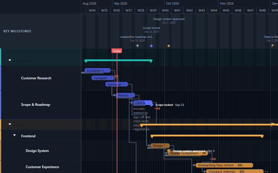
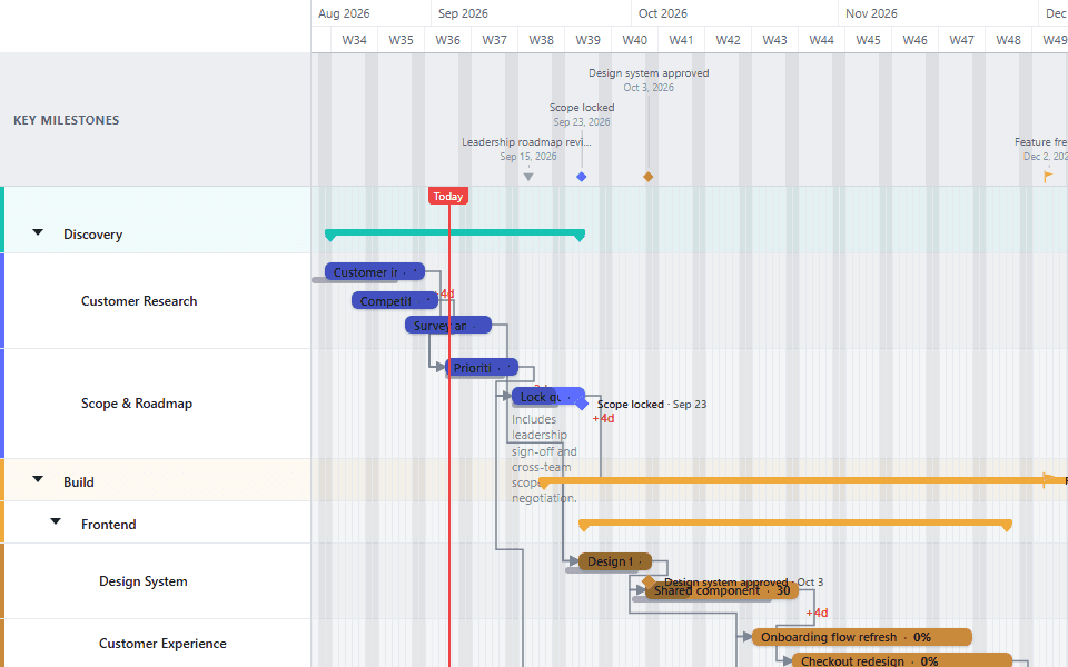
GanttFlow starts from the same underlying idea, tasks as bars on a timeline, but treats dates, dependencies, and milestones as real data rather than formatted cells. Moving a task updates its bar directly. Holding Shift while dragging cascades that same move through everything linked downstream, without touching a formula. A milestone is its own object, not a workaround built from a second chart series.
None of this makes a spreadsheet the wrong tool for what spreadsheets are genuinely good at. It means a schedule with real dependencies, frequent changes, or more than a handful of tasks tends to cost less ongoing effort in a tool built for exactly that shape of problem.
When to stay with Excel
If the schedule is short, changes rarely, and the team already lives inside the spreadsheet for other reasons, there is no strong reason to switch. The cost of the stacked-bar approach only shows up as the plan grows more dynamic and more connected, worth watching for but not worth pre-empting on a project that will never reach that point.
See how to create a Gantt chart for the general approach regardless of tool, or start from a ready-made template close to your kind of project.