
How to Present a Project Timeline to Executives
Strip the chart down to what a decision-maker actually needs: are we on track, what changed, and what do you need from me.
The executive audience wants a different chart than your team does
A working team chart and an executive-facing chart answer different questions, and trying to use the same view for both usually serves neither well. Your team needs enough detail to know what to do this week. An executive audience needs enough to answer one question: is this still going the way we agreed, and if not, what do you need from me.
That difference should drive almost every choice about what to show and how to say it.
Zoom out to phases, not tasks
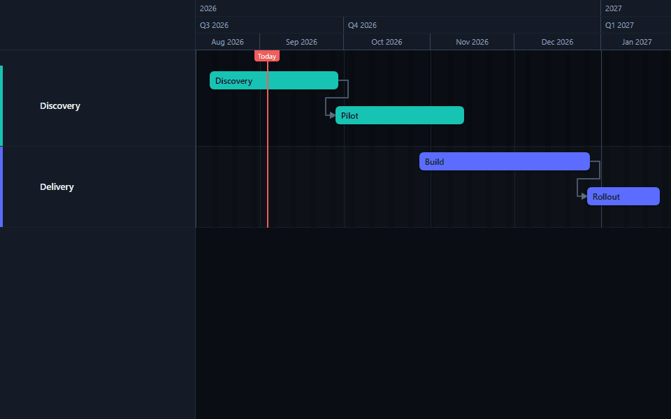
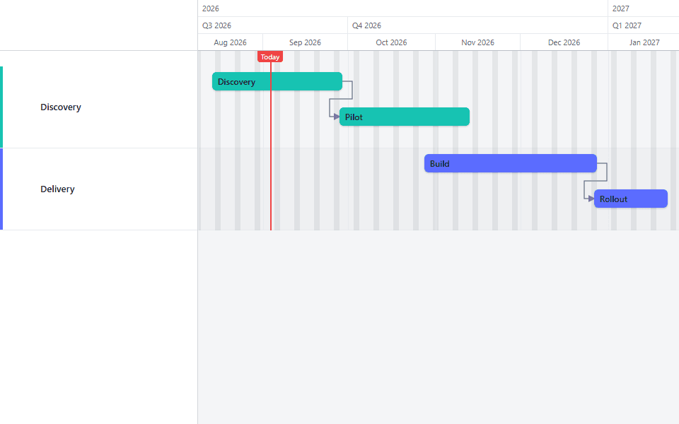
Zoom out until individual tasks collapse into their phase, and collapse sub-lanes the audience doesn't need to see broken out. A chart with six or seven visible bars communicates status faster than one with forty.
Lead with status, not structure
Open the conversation with whether the project is on track, ahead, or behind, and by how much. Walk through the timeline itself second, as supporting detail for a conclusion you've already stated.
End with a specific ask
If the reason you're presenting includes needing a decision, a resource, additional time, or a sign-off, say so explicitly. A chart alone rarely makes the ask for you.
What to cut before the meeting
Individual tasks inside a phase. Collapse them. The audience is evaluating the phase's overall timing, not auditing which specific task is running this week.
Internal process detail. Steps that exist for your team's coordination, like an internal review cycle, usually don't need their own visible bar in an executive view even if they matter enormously to your own planning.
Every dependency arrow. Dependencies matter for your own scheduling. An executive audience rarely needs to see the full web of links; showing only the ones relevant to an explanation you're actively making keeps the chart legible.
Anything you can't explain in one sentence if asked. If a bar or a milestone would require a paragraph of context to justify its presence, it's probably too detailed for this audience, or it needs to be reframed before it goes on the slide.
What to keep, always
Milestones. The fixed dates (go-live, a contract deadline, a board decision point) are usually exactly what this audience is tracking against. Keep them visible even when everything else is collapsed.
Any real delay, honestly shown. If you're using a baseline, keep the variance visible rather than quietly re-planning around it before the meeting. A chart that always looks perfectly on schedule, presented to an audience that later learns it wasn't, costs more credibility than one honest red label ever would.
The overall finish date, and whether it's still standing. This is very often the single fact the audience is actually there to hear confirmed or challenged.
Framing a delay for this specific audience
An executive audience generally responds better to a delay stated plainly with a plan attached than to one buried in chart detail and left for them to notice. "The vendor integration slipped two weeks due to a dependency outside our control. This does not currently threaten the launch date because of existing buffer, but I'm flagging it now in case that buffer gets used elsewhere" gives the audience what they need to decide whether this requires their attention.
Compare that to simply moving the dates and saying nothing: technically accurate, and it reads very differently if the same delay resurfaces later without having been mentioned the first time.
Handling questions that go deeper than the slide
A collapsed, phase-level chart is the right starting point, but an executive audience will sometimes ask a question that needs more detail than the slide shows: why exactly did that phase slip, or what's the actual dependency chain behind a specific date. Having a more detailed working chart ready to reference, without leading the presentation with it, covers this without requiring you to guess in advance how deep the conversation will go.
The mistake to avoid is either extreme: presenting only the collapsed view and having no answer when someone asks for more, or presenting the full working chart up front and losing the room in task-level detail nobody asked to see yet. Lead with the simplified view, and have the detailed one open in a second window or ready to share if the conversation calls for it.
Adjusting the message for a recurring audience versus a one-time presentation
A steering committee that sees this chart every month develops context a first-time audience doesn't have. For a recurring audience, you can reference "the vendor delay we flagged last month" without re-explaining it from scratch, and the presentation can move faster because the baseline understanding is already there.
A one-time or infrequent presentation, such as a kickoff review, a quarterly business review, or a board update, needs more framing built in, since the audience has no prior context to draw on. State plainly what the project is, what's been delivered so far, and what the current plan covers, before getting into status. Skipping this step because it feels obvious to you, who has been living in the project daily, is one of the more common ways a status update loses an audience that hasn't.
When the news is genuinely good
Not every executive update carries a delay or a risk to flag, and a status update that's always framed defensively, even when things are going well, reads oddly over time. When the project is on track, say so plainly and briefly, rather than searching for something to caveat. "The project remains on the dates agreed at kickoff, with the two upcoming milestones (user acceptance testing and go-live) both on schedule" is a complete, confident update that doesn't need padding.
A layout that works on one slide
A title stating the project and the reporting date. The chart itself, collapsed to phases and milestones, taking most of the slide's width. No more than three short lines beneath or beside it: overall status, what changed since the last update, and what you need from the audience, if anything. Resist the urge to fill remaining space with more chart detail; an executive slide with room to breathe reads as more in control than one crammed with everything you know.
For the mechanics of getting the chart onto a slide, see exporting to PowerPoint. For a version meant to be sent as a standalone document rather than presented live, see exporting to PDF.
See a compact example of this level of simplification in the executive roadmap template, and a multi-project version in the project portfolio template.
Common questions
- How much detail should an executive-level Gantt chart show?
- Phases and milestones, generally not individual tasks. An executive audience is deciding whether to trust the plan and what, if anything, needs their attention, not managing the day-to-day sequence of work. A chart with 40 visible task bars answers a question this audience isn't asking and buries the few things they actually need to see.
- Should I show a delay or bad news to an executive audience, or wait until it's resolved?
- Show it, with a clear explanation and your plan to address it. An executive audience that finds out about a problem after it's already resolved, rather than while it's live, tends to lose confidence in the reporting more than in the problem itself. A chart with an honestly shown delay and a stated response is more credible than one that always looks clean until it isn't.
- What's the difference between presenting to executives and presenting to a client?
- An executive audience inside your own organization is usually deciding about resourcing, priorities, or escalation, and can tolerate more candor about risk. A client audience is often also evaluating the relationship itself, which shifts the tone toward reassurance alongside honesty. Both need the chart simplified to phases and milestones; the framing of bad news and the level of internal detail shared differs more than the format does.
- Should I use PowerPoint or send the chart as its own document?
- Depends on the setting. A live meeting with a slide deck usually calls for the chart exported as a PNG and placed on a slide, sized to leave room for a short headline and any asks. A written update sent ahead of a meeting, or a reference document meant to be filed, is often better as a standalone PDF export. See exporting to PowerPoint and exporting to PDF for the mechanics of each.
- How often should I present a project timeline to executives?
- Match the cadence to the decision rhythm the audience actually operates on, not to how often the underlying plan changes. A monthly steering committee usually wants a monthly view even if the working chart changes daily. Presenting more often than the audience is set up to act on creates noise; presenting less often risks surprising them with a problem that's been building for weeks.