
Project Portfolio Gantt Chart Template
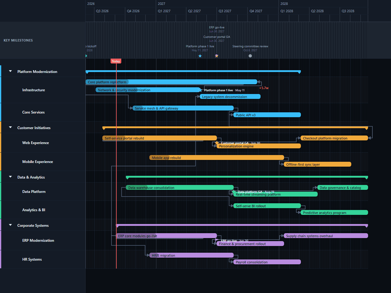
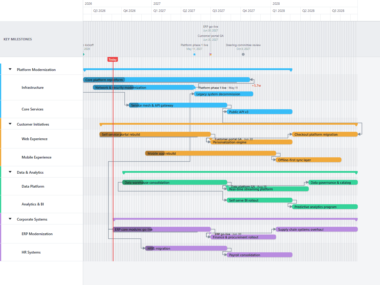
A portfolio-level view spanning platform modernization, customer experience, data & analytics, and corporate systems as four concurrent, multi-year programs, each split into two work-streams. The dependencies aren’t confined inside a single program the way most templates’ are — ERP go-live gates both legacy decommissioning and the HR systems migration, and a start-to-finish link keeps the checkout platform’s cutover honest against when the new public API actually starts. Built for a PMO or portfolio manager who needs to zoom out past any single project and show how the programs actually depend on each other.
- Platform Modernization
- Customer Initiatives
- Data & Analytics
- Corporate Systems
Download the plan free as a CSV: phases, tasks, dates, and dependencies, ready to open in Excel, Google Sheets, or Numbers. Open it in GanttFlow instead and it drops in as a fully editable, presentation-ready Gantt chart (Pro).
A portfolio chart exists to answer an uncomfortable question: have we committed to more than we can deliver, and does one programme's date secretly depend on another's? It's not a planning tool for any individual project, and it should never be detailed enough to be mistaken for one. This template covers nine months, four programmes, and the handful of real cross-programme dependencies that actually bind them together.
Who this project portfolio template is for
This is for a PMO lead, a transformation director, or an executive who owns a slate of programmes rather than any single one. It assumes multiple concurrent efforts with a shared funding pool, a governance body that reviews them together, and at least one programme whose start date genuinely gates another's.
The audience is a steering committee, an executive team, or a board. They're making portfolio decisions (start, stop, defer, refund) and they need to see the whole set at once, including where the dependencies actually are, which is the one thing individual project plans structurally can't show them.
What goes on a portfolio timeline?
Four top-level lanes, each split into two work-streams.
Platform Modernization splits into Infrastructure (network and security modernization, the core platform replatform, and legacy system decommission) and Core Services (a service mesh and API gateway, then public API v3).
Customer Initiatives splits into Web Experience (a self-service portal rebuild, then a personalization engine) and Mobile Experience (a mobile app rebuild).
Data & Analytics splits into Data Platform (a data warehouse consolidation) and Analytics & BI (a self-serve BI rollout).
Corporate Systems splits into ERP Modernization (core modules going live, then finance and procurement rollout) and HR Systems (an HRIS migration).
Four milestones sit across the timeline: a kickoff and three programme-level delivery dates, platform phase one live, customer portal general availability, and ERP go-live.
How long are portfolio items?
Every bar on this chart is sized in months, not weeks of work. Platform Modernization spans about thirty-three weeks, the longest of the four; Customer Initiatives and Data & Analytics each run about twenty-six weeks; Corporate Systems runs about twenty-nine.
Two observations matter more than the individual numbers.
First, every work-stream here runs at least five months. If something on your portfolio chart is a six-week effort, it's not a portfolio item; it belongs on a team's own plan, and putting it here dilutes the chart.
Second, all four programmes overlap through most of the middle of the year. That's the chart's real content. Nobody wrote "we are overcommitted" anywhere on it; the geometry says so, and geometry is much harder to argue with in a governance meeting than a slide asserting the same thing.
Why there are dependencies here, and why so few
This template has six links, deliberately few for thirteen tasks across four programmes. Most work-streams here run on their own schedule with no dependency at all pulling them along, which is the honest default at portfolio scale.
Two links stay inside their own programme: the service mesh and API gateway rollout is keyed to when the core platform replatform starts, not when it finishes, and the self-service portal rebuild feeds the personalization engine directly. The data warehouse consolidation is keyed to its own analytics rollout the same way, tied to start rather than a separately-tracked date.
The two that genuinely cross programme boundaries are the ones worth drawing attention to. ERP go-live is start-to-start with both legacy decommissioning and the HR systems migration both depend on ERP go-live starting, not finishing, because both draw on capabilities the ERP programme establishes early rather than waiting for its full rollout to close.
Every other relationship between programmes is left undrawn on purpose. At portfolio scale, most cross-programme relationships are financial and human, not sequential: the mobile app rebuild doesn't wait for the data warehouse, it competes with it for budget and engineers. Drawing an arrow there would imply a sequencing constraint that doesn't exist. Add a link only when one programme genuinely can't proceed without another, the way ERP go-live gates the two programmes it does here.
What to change for your own portfolio
Group by funding line, not by team
Lanes should match how money is allocated and decisions are made. If your board approves by business unit, the lanes are business units, that's the cut they'll reason about.
Set each delivery milestone to a real committed date
Platform phase one, customer portal GA, and ERP go-live are decision points. Place them on the dates your governance body actually reviews against, not on whatever the template shipped with.
Audit every cross-programme link before you keep it
This template has two. If you're tempted to add a third, check it's a genuine "can't start without" constraint and not a preference: the two here both key another programme's start to when ERP go-live starts, not to its own separate timeline.
Draw what's committed, not what's hoped
A portfolio chart including unfunded aspirations is the fastest way to lose the committee's trust. Keep a second chart for the pipeline if you need one.
Baseline annually
Portfolio drift is slow and therefore easy to miss. A year-old baseline beside the current view is often the single most persuasive artefact in an annual planning session.
Common mistakes on portfolio charts
Mixing altitudes. A nine-month programme and a three-week integration on the same chart makes both harder to read.
Too many lanes. More than about six top-level programmes and the chart stops being scannable. Nest work-streams under a programme instead of adding more top-level rows.
Dependency spaghetti. Arrows between programmes that merely compete for budget suggest sequence where the real constraint is capacity.
No decision points. A portfolio chart with no governance milestones is a status picture. With them, it's an agenda.
Day or week zoom. At this horizon, anything finer than months turns the chart into noise.
Presenting the portfolio
This chart's entire purpose is to be looked at by a group of people at once. Export a PDF for the board pack and a PNG for the slide, refresh it before each steering review, and keep the prior version alongside. Nobody in the room needs an account or access to your project tools to read it, which is exactly why the portfolio view works as a shared reference rather than as one person's spreadsheet.
Questions about this template
- What is a project portfolio timeline?
- A single chart showing every major programme an organisation has committed to, drawn at a scale where overlaps and cross-programme dependencies are both visible. This template spans about nine months across four programmes, each split into two work-streams, thirteen tasks in total. It's not a plan for any one project; it's the view that shows whether the whole set is deliverable, and where one programme's date is actually resting on another's.
- How many programmes should be on a portfolio chart?
- Enough to represent the real commitment and few enough to read, which in practice means four to six top-level lanes. This template ships with four, each nested into two work-streams so thirteen tasks stay legible without twenty-six separate rows at the top level.
- Why does ERP go-live gate both legacy decommissioning and the HR migration?
- Because both genuinely depend on it starting, not on it finishing. Legacy decommissioning and the HR systems migration are both linked to ERP go-live as start-to-start dependencies, real cross-programme constraints, not the aspirational arrows most portfolio charts avoid. When a dependency crosses a funding boundary like this, it's worth drawing, because the two programme owners need to see it.
- Why is the core platform replatform linked to the service mesh rollout?
- Because the mesh and API gateway work is keyed to when the replatform *starts*, a start-to-start dependency: it begins as soon as the new platform direction is set rather than waiting for the replatform to be fully done. That's the one dependency inside Platform Modernization worth naming: everywhere else in this template, a programme's second work-stream is left to run on its own schedule rather than chained to the first.
- What timescale should a portfolio chart use?
- Quarters or months, never days. This template covers roughly nine months, and at day resolution the denser weeks would be unreadable. Zooming out isn't a loss of information at this altitude: precision beyond the week is false on a horizon this long anyway.
- How is a portfolio chart different from a program roadmap?
- Altitude and purpose. A program roadmap coordinates teams working toward shared delivery dates, so dependencies and milestones matter throughout. A portfolio chart mostly compares independent investments competing for the same money; dependencies appear only where a programme genuinely can't start without another, which is why this template has just six of them across thirteen tasks.