
How to Export a Gantt Chart to PDF for a Client Presentation
Get a clean PNG or PDF out of your timeline, without a screenshot tool.
One click, no screenshot tool
A Gantt chart is easier to send as an image than to hand someone a live editor link. GanttFlow exports directly from the chart you're already looking at, so what you send matches what you built.
That last point matters more than it sounds. A screenshot captures your window, including whatever was scrolled off, whatever was half-covered by a panel, and whatever resolution your monitor happens to be. An export renders the chart itself, at full width, regardless of what fits on your screen.
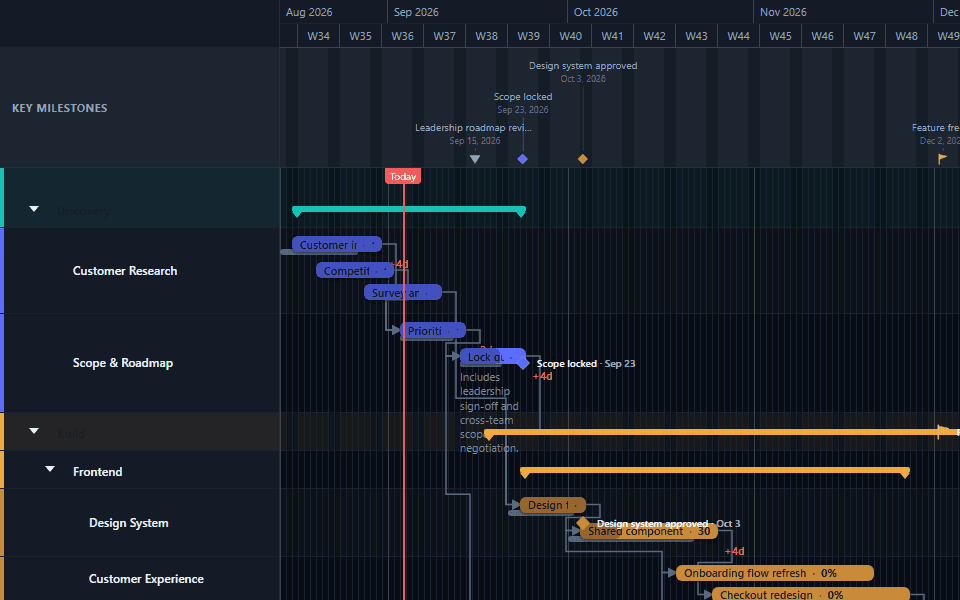
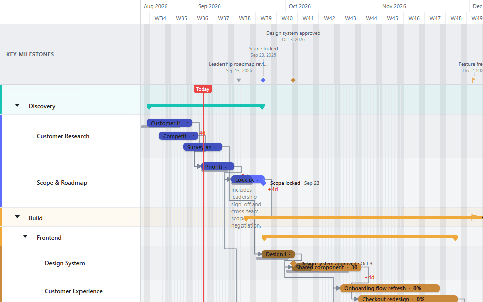
Open the export menu
In the toolbar, choose PNG or PDF.
Export a PNG for free, or a PDF on Pro
PNG export works on every plan. Free exports include a small "Made with GanttFlow" watermark; Pro exports don't. PDF export is Pro only, and better suited to a client-facing document than an image file.
PNG or PDF: which one to send
They are not interchangeable, and picking the wrong one is the most common reason an exported chart lands badly.
Send a PNG when the chart is going into something else. A slide deck, a Notion page, a Slack message, an email body, a status report someone else is assembling. PNG drops in anywhere, previews inline in every tool, and needs no application to open. This is the right choice for the weekly update.
Send a PDF when the chart is the document. A client deliverable, a contract annexe, a board pack, anything that will be printed or archived. PDF holds its resolution when someone zooms in to read a task name, prints predictably, and reads as a formal artefact rather than a picture someone pasted in.
The practical test: if the recipient will look at it and move on, PNG. If they will forward it, print it, or file it, PDF.
Getting the chart ready before you export
The export renders what is on the chart, so the preparation happens before you click anything.
Set the timescale to fit the story. A ten-month programme exported at day resolution produces an extremely wide image where every bar is a sliver. Zoom out to weeks, months, or quarters until the whole plan reads at a glance; see the zoom guide for how the levels differ.
Collapse the detail your audience does not need. Sub-lanes are useful while you build and noisy when you present. Collapsing a phase to its summary bar is often the difference between a chart an executive reads and one they skim past.
Check the labels at export size. Task names that are perfectly legible in the editor can crowd each other in an exported image, particularly at wider zoom levels. If a name is truncated, shorten it rather than hoping the reader infers it.
Decide about progress and baselines. A chart showing percentage complete answers a question your audience would otherwise ask. A chart showing baselines answers a different and sometimes more uncomfortable one. Both are useful; neither should be on by accident.
Pick the theme deliberately. A dark chart looks good on screen and can waste a considerable amount of toner when printed. If the PDF is going into a printed pack, export the light theme.
Why a live link is usually the wrong thing to send
It is tempting to send a URL instead of a file, and it is almost always worse for the recipient.
A link requires them to have an account, or to be online, or to trust a domain they do not recognise. It shows them the chart as it is right now, which means the plan they discussed in Tuesday's meeting is not the plan they see on Thursday. And it cannot be attached to a contract, pasted into a deck, or filed.
An exported file is a fixed record of what you said on the day you said it. For a status update or a client deliverable, that is the point. Keep the live chart for yourself and send the export. This is also why nobody receiving your chart ever needs a GanttFlow account.
Common export problems
The image is enormously wide. The timescale is too fine for the span. Zoom out.
Text is unreadable when printed. Usually a dark-theme export on paper, or too many bars crammed into a short chart. Switch to the light theme, and consider splitting a very long programme into two exports by phase.
The watermark is on a client deliverable. Free PNG exports carry a small GanttFlow mark. Pro removes it. There is no way to remove it on the free plan, and editing it out of the image afterwards is a licensing problem rather than a clever workaround.
The exported chart does not match what you saw. Almost always because something was still selected or a panel was open. Deselect everything and export again.
You need it in a format that is not PNG or PDF. Pro also includes a JSON project export, which is a backup and a data handoff rather than a presentation format: useful for archiving a plan or moving it between accounts, not for showing anyone.
A repeatable weekly rhythm
Once a plan is live, the export step is worth making routine. Update the planned dates and manual progress values, check the variance against your baseline, export a PNG, and paste it into the update. It takes under a minute and it produces a visual record of how the plan moved over the life of the project, which, at the end, is often more valuable than the final chart itself.
Fitting a chart to the medium it is going into
The single biggest determinant of whether an exported chart lands well is whether its shape matches where it is going, and that is a decision you make with the timescale rather than with the export settings.
A slide is roughly sixteen units wide by nine tall. A chart with forty bars and a day-level timescale is nothing like that shape; it is a long, thin ribbon that will be scaled down until nothing is readable. If the chart is destined for a deck, zoom out until it is wider than it is tall but not dramatically so, and collapse sub-lanes until the bar count is somewhere under twenty.
A printed page is taller than it is wide. This is the opposite problem, and it is why construction and portfolio programmes so often print badly. For a portrait page, favour fewer lanes and a wider timescale; for a landscape page, you have more room and can afford the detail.
An email or a chat message is read on a phone as often as a laptop. Assume the reader is looking at something about the width of their hand. Anything with more than about a dozen bars will be pinched and scrolled rather than read, so send a collapsed phase-level view and keep the detailed chart for the meeting.
A useful habit is to build one project and export it two or three different ways: a collapsed phase view for leadership, a full detail view for the delivery team, a printed light-theme view for the pack. It is the same plan each time, which is exactly the point: everyone is looking at one source of truth rendered at the altitude they need.
The executive roadmap template shows a compact leadership view. The project portfolio template shows how a multi-year plan can be collapsed for a board pack. Both schedules are illustrative and need your own dates before use.
Common questions
- Should I send a Gantt chart as a PNG or a PDF?
- PNG when the chart is going into something else - a slide, a Notion page, an email, a Slack message. PDF when the chart is the document, such as a client deliverable, a board pack, or anything that will be printed or archived. The quick test: if the recipient will look and move on, send a PNG; if they will forward, print, or file it, send a PDF.
- Does the person receiving my chart need a GanttFlow account?
- No. An export is an ordinary image or PDF file, so anyone can open it with no account, no login, and no software. This is the main reason to send an export rather than a live link: a link requires the recipient to have access and shows them the chart as it is today, not as it was when you discussed it.
- How do I remove the watermark from an exported chart?
- Upgrade to Pro. Free PNG exports carry a small Made with GanttFlow mark and there is no way to disable it on the free plan. Pro removes it from PNG exports and adds PDF export, which has no watermark either.
- Why is my exported image so wide?
- The timescale is too fine for the span of the project. A ten-month programme exported at day resolution produces an extremely wide image where every bar is a sliver. Zoom out to weeks, months, or quarters before exporting so the whole plan reads at a glance.
- Can I export the underlying project data rather than a picture?
- Yes, on Pro. A JSON project export gives you the full structure of the plan as data, which is useful for archiving a project or moving it between accounts. It is a backup and handoff format rather than a presentation one - for anything you are showing a person, use PNG or PDF.